

Note
Go to the end to download the full example code or to run this example in your browser via Binder.
How to Create Time Slices#
In this example we show how to create a filled contourplot of transient data over a sampling line. For this purpose we use a component transport example from the ogs benchmark gallery (https://www.opengeosys.org/docs/benchmarks/hydro-component/elder/).
To see this benchmark results over all timesteps have a look at How to create Animations.
Let’s load the data which we want to investigate.
import numpy as np

import ogstools as ot
from ogstools import examples

mesh_series = examples.load_meshseries_CT_2D_XDMF().scale(time="a")
si = ot.variables.saturation
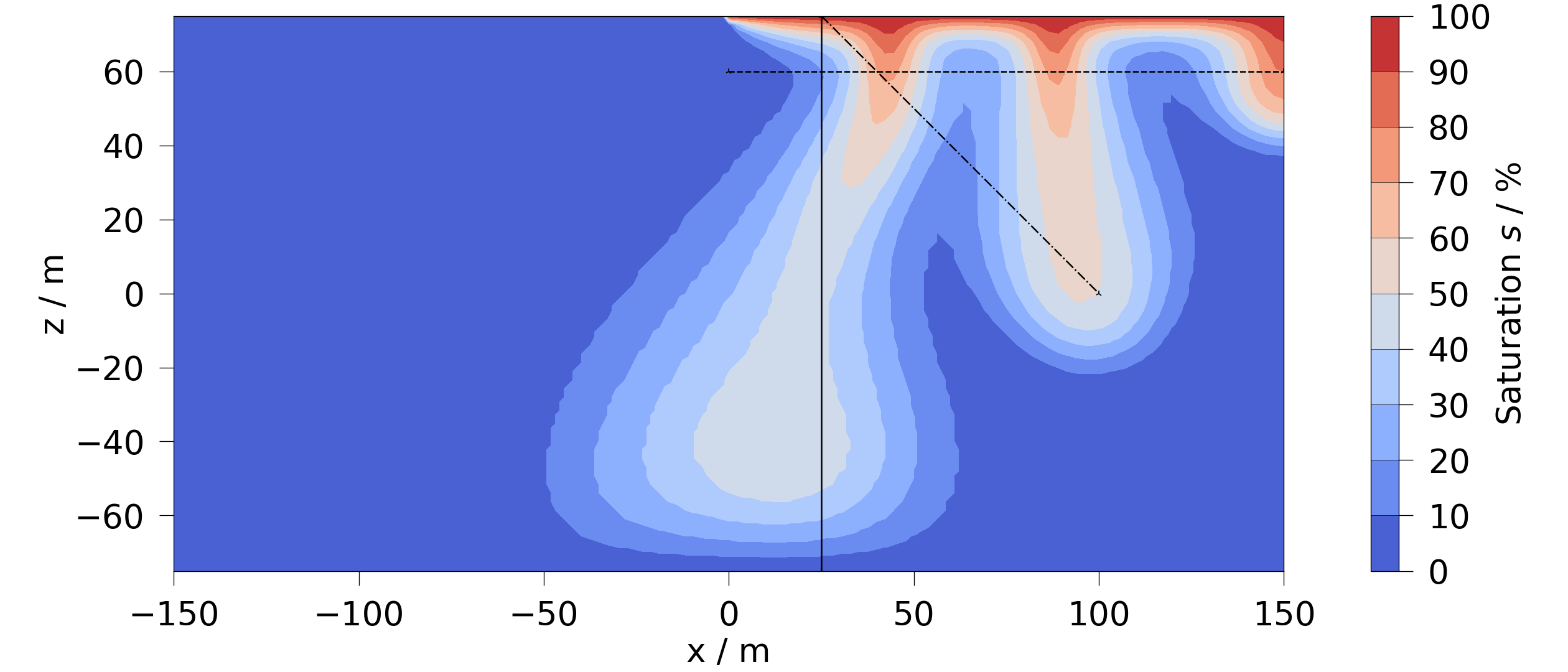
Now we setup two sampling lines.
pts_vert = np.linspace([25, 0, -75], [25, 0, 75], num=300)
pts_diag = np.linspace([25, 0, 75], [100, 0, 0], num=300)
fig = ot.plot.contourf(mesh_series.mesh(-1), si, vmin=0)
fig.axes[0].plot(pts_vert[:, 0], pts_vert[:, 2], "-k", linewidth=3)
fig.axes[0].plot(pts_diag[:, 0], pts_diag[:, 2], "-.k", linewidth=3)
[<matplotlib.lines.Line2D object at 0x7f577821b860>]
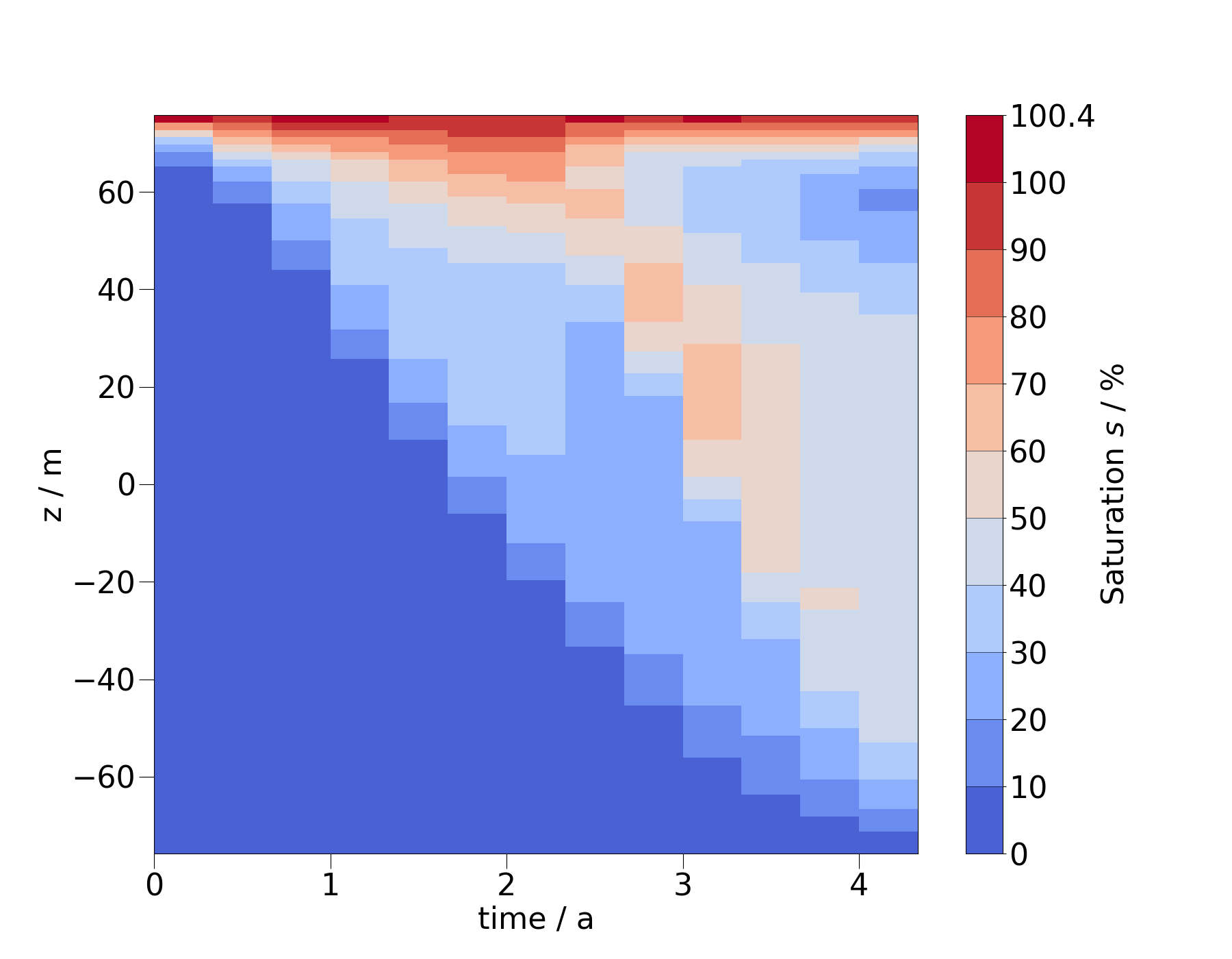
Here, we first show a regular line sample plot for the vertical sampling line for each timestep.
As the above kind of plot is getting cluttered for lots of timesteps we
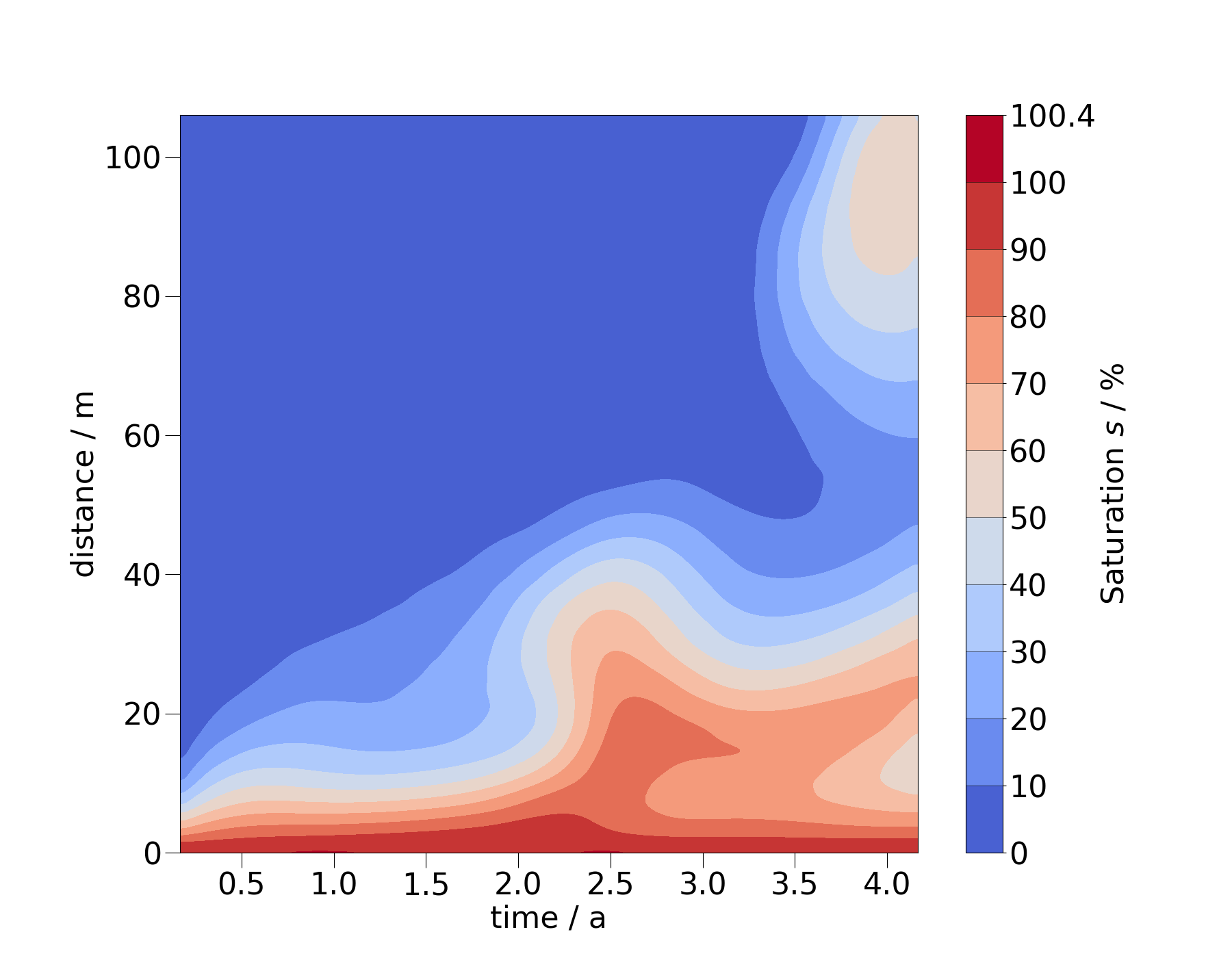
provide a function to create a filled contour plot over the transient data.
The function plot_time_slice()
creates a heatmap over time and space.
fig = ms_vert.plot_time_slice("time", "z", si, vmin=0, vmax=100)
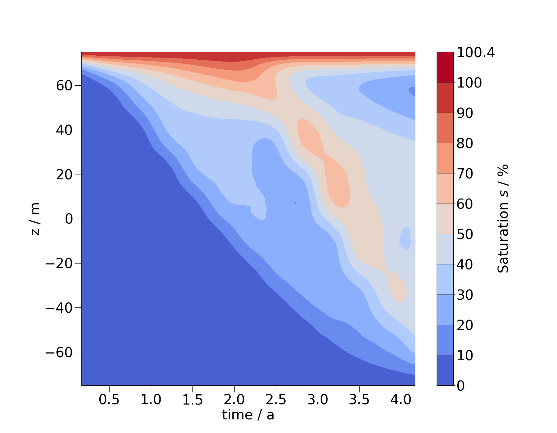
The stepping in this heatmap corresponds to the individual timesteps. To create a smoother image, we can resample the MeshSeries to more timesteps.
ms_vert_fine = ms_vert.resample_temporal(np.linspace(0, 4.2, 300))
fig = ms_vert_fine.plot_time_slice(
    "time", "z", si, vmin=0, vmax=100, time_logscale=True
)
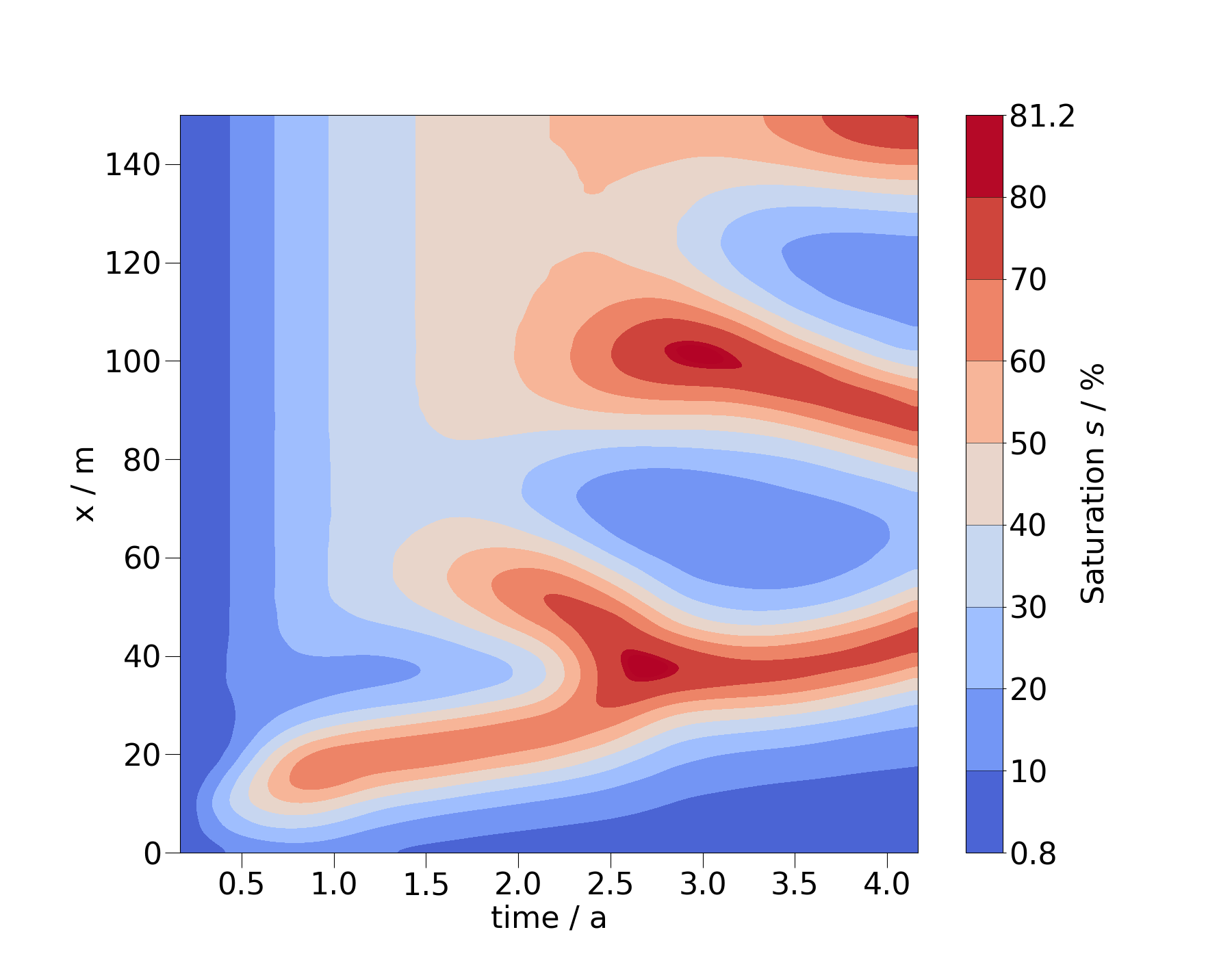
You can also change the order of the arguments for spatial coordinate and time to flip the x- and y-axis.
ms_diag = mesh_series.probe(pts_diag)
ms_diag_fine = ms_diag.resample_temporal(np.linspace(0, 4.2, 300))
fig = ms_diag_fine.plot_time_slice("x", "time", si, vmin=0, vmax=100)
fig.axes[0].invert_yaxis()
Total running time of the script: (0 minutes 2.845 seconds)